
"For our shoot plan we have decided to base our shoot on props such as wigs, hats, masks and sunglasses to create a hidden and complex personality and character in the photograph. We have decided to shoot on high key as it will be easier for us to photoshop afterwards as we are going to experiment with different types of backgrounds by using different colours and textures, also because I tend to do a lot of photographs on low key.
We planned to have two lights either side of the model at the back to light up the high key backdrop and one key light to camera right, and one fill on camera left and one on camera right to reflect the light onto the model.
Here are photographs which gave me inspiration for this photoshoot:
Heather and Ellie

Joshua Hoffine
Joshua hoffine has work that i have never seen stuff like that before, he is a horror photographer, and his photographs actually give me a chill, i can see them as being very controversial, but i like his creativity side to the way he works, and his lighting always seems to be very interesting and unique.
I choose this photograph of his because it ties in with the mask theme for inspiration for my studio shoot.

Kevin Brannaman
I really like the colours and composition of this photograph. I love how the model has the bunny mask on and the fact their in the garden with carrots i really like the overall theme and feel to this photograph.

Cindy Sherman
these bright coloured photographs and the way the models are presented give a confusing fake character.


Gillian Wearing, took photographs of people wearing masks, the masks look like how you would imagine the person to look like, however with little face detail and the person looks fake. I really like these weird odd photographs.


Here are some final photos from the photoshoot which i photoshopped:
(Below) For this photograph I made the photograph of Joe in the sheep mask black and white, and changed the curves so there were more ranges of tones and a stronger contrast within the photograph, i then put a photograph of rubbish in the background, to create a confusing harsh effect type background which works well with the pose of Joe. I turned the saturation down of the rubbish, so it was in-between colour and black and white. I really like the composition of this photography and how i have framed him in the photo.

(Below) Firstly I changed this photograph to Black and white, and changed the curves so there was a nice strong contrast and variation of tones within the photograph. I removed any blemishes, and i then dragged this newspaper background onto the photograph of Mickayla and erased away to leave her photograph with a newspaper background. Overall I'm really happy with this photograph and think the background works well with the photo of Mickayla.

For this photograph i decided to play about with the burn tool, i wanted to go for the dark grungy effect. so i burned her eyes, mouth and bits of her arm and neck, I think to improve this photograph i should have burned her t shirt. I then created the gradient background by using the gradient tool.

(Below) Here i liquefied the photograph on Joe's eyes to make then wider, i also pulled his eyebrows up and his smile. I then created a hue and saturation layer, and turned the saturation down so the photograph was in-between colour and black and white. I then got the black paint bucket and clicked on the photograph, then using an eraser, i erased at the face to give him this dark grey gruesome looking skin. Then using the magnetic lasso tool i went around they eyes and tongue, i then created a hue and saturation layer and turned the hue so it went purple, this then made the eyes and tongue purple. Using a big black brush with no hardness i created this dark circle around the photograph to add a dark grungy feel to the photograph.

(Below) Firstly I went into liquify to create these evil eyes and smile. then using a big black brush on low hardness i created this dark circle around the photograph to give the photograph an evil feel. then going into hue and saturation and turning the saturation down so it was in between colour and black and white.


 (Below) Again, I smoothed the skin, and lightened it using curves to create a contrast between her pale skin and dark


 (Below) I really like Jordan's position and pose in this photograph, he looks very masculine, and I think the top looks really good on him and emphasizes his body. I really like this photograph in black and white and didn't like the colour version, in the colour version his skin looked very red and his top is striped green which clashed and wasn't good for his complexion.
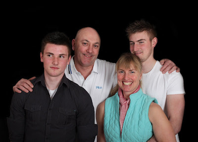
  (Below) One of my favourite photographs from the shoot, mainly because its so natural and there not posed. The mum is laughing and the boys are looking at each other and almost smirking, I think this photograph really captures the character of the family. It works great in black and white and really emphasizes the laughter in the mums face. There's also a great range of tones and I'm pleased how I positioned the the two lads either side of their mum. Here I made the background pure black but didn't do any other photoshopping to the photograph because I feel family portraits should be a true representation of the family and should not appear or look fake.


 (Below) I really like this photograph - two brothers messing around posing.


 Here i smoothed the skin, removed small moles, whitened the background to pure white and then lightened a floral wallpaper background so you can faintly see it, but it doesn't take your eye away from the model.
